Guardian data blog — UK general election analysis in R
The Guardian newspaper has for a few years been running a data blog and has built up a massive repository of (often) well-curated datasets on a huge number of topics. They even have an indexed list of all data sets they've put together or reused in their articles.
It's a great repository of interesting data for exploratory analysis, and there's a low barrier to entry in terms of getting the data into a useful form. Here's an example using UK election polling data collected over the last thirty years.
ICM polling data
The Guardian and ICM research have conducted monthly polls on voting intentions since 1984, usually with a sample size of between 1,000 and 1,500 people. It's not made obvious how these polls are conducted (cold-calling?) but for what it's worth ICM is a member of the British Polling Council, and so hopefully tries to monitor and correct for things like the "Shy Tory Factor"—the observation that Conservative voters supposedly have (or had prior to '92) a greater tendency to conceal their voting intentions than Labour supporters.
Preprocessing
The data is made available from The Guardian as a .csv file via Google spreadsheets here and requires minimal cleanup, cut the source information from the end of the file and you can open it up in R.
sop <- read.csv("StateOfTheParties.csv", stringsAsFactors=F)
## Data cleanup
sop[,2:5] <- apply(sop[,2:5], 2, function(x) as.numeric(gsub("%", "", x)))
sop[,1] <- as.Date(sop[,1], format="%d-%m-%Y")
colnames(sop)[1] <- "Date"
# correct for some rounding errors leading to 101/99 %
sop$rsum <- apply(sop[,2:5], 1, sum)
table(sop$rsum)
sop[,2:5] <- sop[,2:5] / sop$rsum
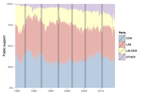
Then after melting the data.frame down (full code at the end of the post), you can get a quick overview with ggplot2.
Election breakdown
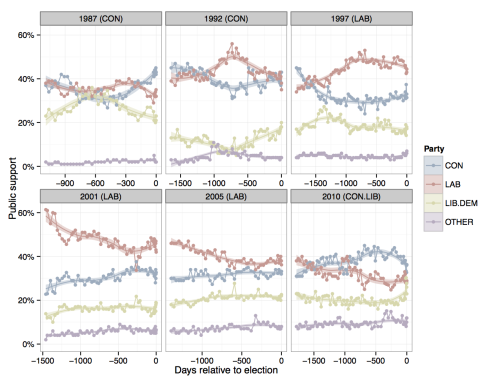
The area plot is a nice overview but not that useful quantitatively. Given that the dataset includes general election results as well as opinion polling, it's straightforward to split the above plot by this important factor. I also found it useful to convert absolute dates to be relative to the election they precede. R has an object class, difftime, which makes this easy to accomplish and calling as.numeric() on a difftime object converts it to raw number of days (handily accounting for things like leap years).
These processing steps lead to a clearer graph with more obvious stories, such as the gradual and monotonic decline of support for Labour during the Blair years.
NB Facet headers show the election year and result of the election with which the (preceding) points are plotted relative to.
Next election's result
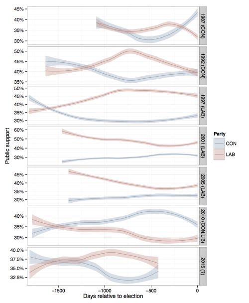
I originally wanted to look at this data to get a feel for how things are looking before next year's (2015) general election, maybe even running some predictive models (obviously I'm no fivethirtyeight.com).
However, graphing the trends of public support for the two main UK parties hints it's unlikely to be a fruitful endeavour at this point, and with the above graphs showing an ominous increasing support for "other" parties (not accidentally coloured purple), it looks like with about 400 days to go the 2015 general election is still all to play for.
Reproduce and improve this analysis with help from
this gist.
This post was originally published on my
Wordpress blog.


