Meticulously recreating bitmap plots in R
There's a hard-fought drive on Wikimedia commons to convert those images that should be in vector format (i.e. graphs, diagrams) from their current bitmap form. At the time of writing, the relevant category has over 7000 images in the category "Images that should use vector graphics".
The usual way people move between the two is by tracing over the raster, and great tools like Inkscape (free open-source software) can help a lot with this. But in the case of graphs I thought it'd be fun to try and rebuild a carbon copy from scratch in R.
The original
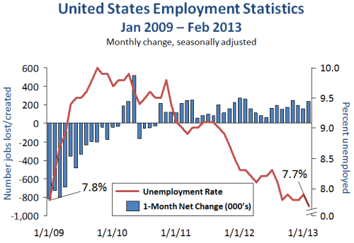
The file that first caught my eye was this nice graph of US employment stats, currently used on the highly-trafficked Obama article. I'm not sure what drew this originally, it doesn't look like Excel because of the broken axis and annotations, but maybe it is. It's currently a png at about 700 × 500 so should be an easy target for improvement.
 This is the original bitmap plot I wanted to recreate.
(Courtesy of Wikimedia Commons)
Figure 2.0
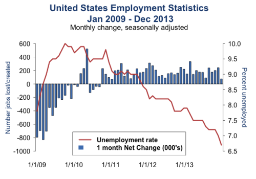
The two raw data files are available here and here as Excel spreadsheets. They have some weird unnecessary formatting so the various xls parsers for R won't work; save the tables from Excel as csv. I won't talk through the code as it wasn't too taxing (or clean) but it'll be at the end of the post. Here's what I came up with:
I expanded my plot to include the 2013 data, so it inescapably has slightly different proportions to the original. And I was working on a single monitor at the time so I didn't have a constant comparison. I can see now a few things are still off, the fonts are different sized for one and I ditched the broken axis, but overall I think it's a decent similarity!
ggplot2 version
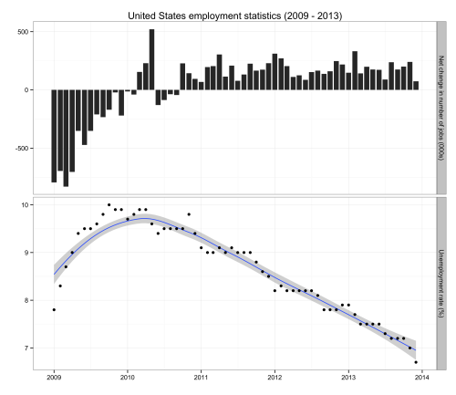
Two y-axes on the same graph is bad, bad, bad and unsurprisingly forbidden with ggplot2 but I did come across this method of dummy-facetting and then plotting separate layers per facet. An obvious problem is now the y-axis are representing different things and you only have one label. A hacky fix is to write your ylabs into the facet header (I'm 100% confident Hadley Wickham and Leland Wilkinson would not be impressed with this). Another alternative would be to use map a colour aesthetic to your y-axis values and label it in the legend (again, pretty far from recommended practice).
This is what I ended up with, I still think it's a reasonable alternative to the above, and the loess fitted model nicely shows the unemployment rate trend without the seasonality effects:
Article version
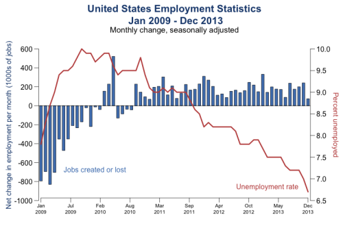
While mimicking the original exactly was fun (for me at least), I tried to improve upon it for the actual final figure for use on Wikipedia. For instance, it now uses unambiguous month abbreviations, and I swapped the legend for colour-coded text labels. It still has some of the original's charm though. Looks like after a bit of a rough patch, your employment statistics are starting to look pretty good Mr. President.
Next up, the other much less attractive figures on that page ([1], [2]).
Code available in a gist.
Originally published on my
Wordpress blog.


